
Bethesda Dental Specialist
PRINT
Magazine Ad
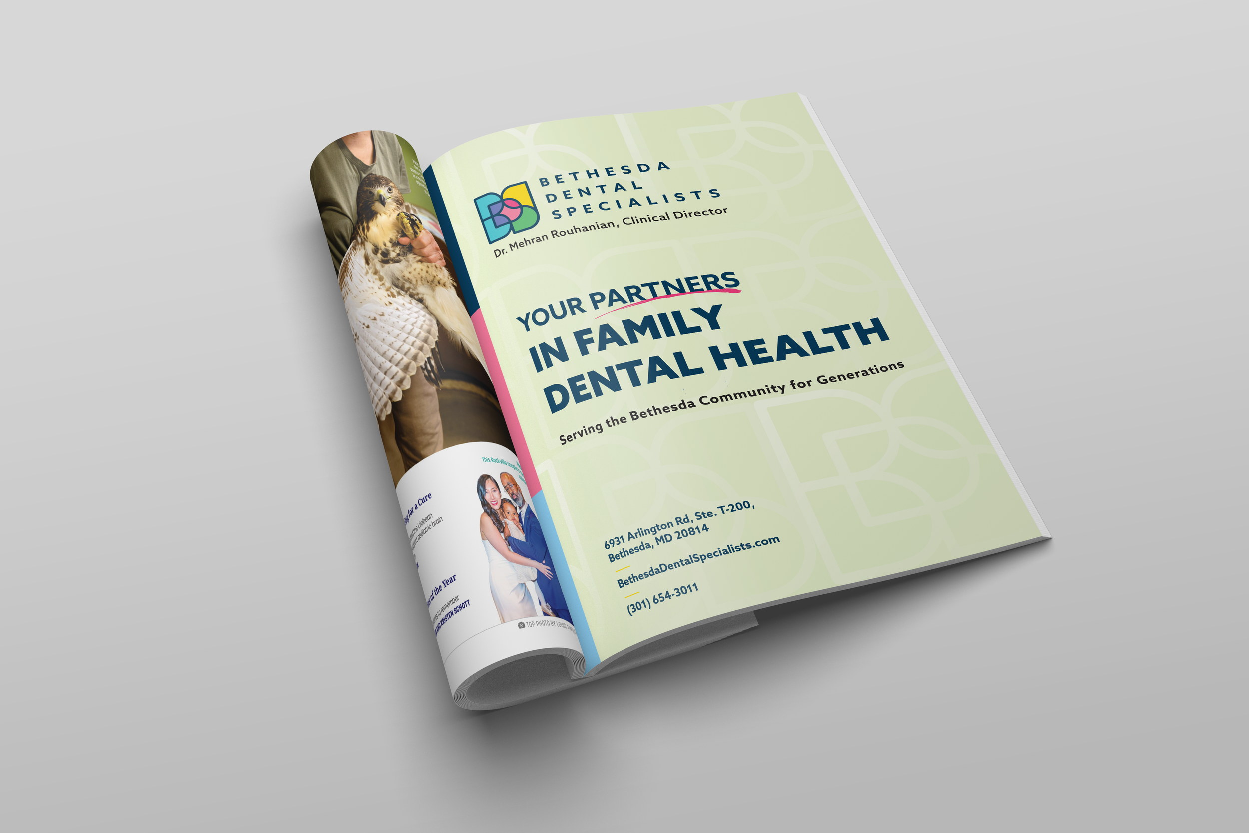
Bethesda Dental Specialists needed a magazine ad for Bethesda Magazine — one that felt modern without abandoning their existing brand. Their primary yellow is an unconventional tone that can read flat in isolation, so I paired it with navy, pink, and blue to create the contrast needed to make it land. A vertical color block frames the composition and anchors the headline left, while mixed type weights pull attention to their slogan. I introduced their pencil scratch icon to add character without competing with the messaging.
Additional Work
PRINT
Brochure
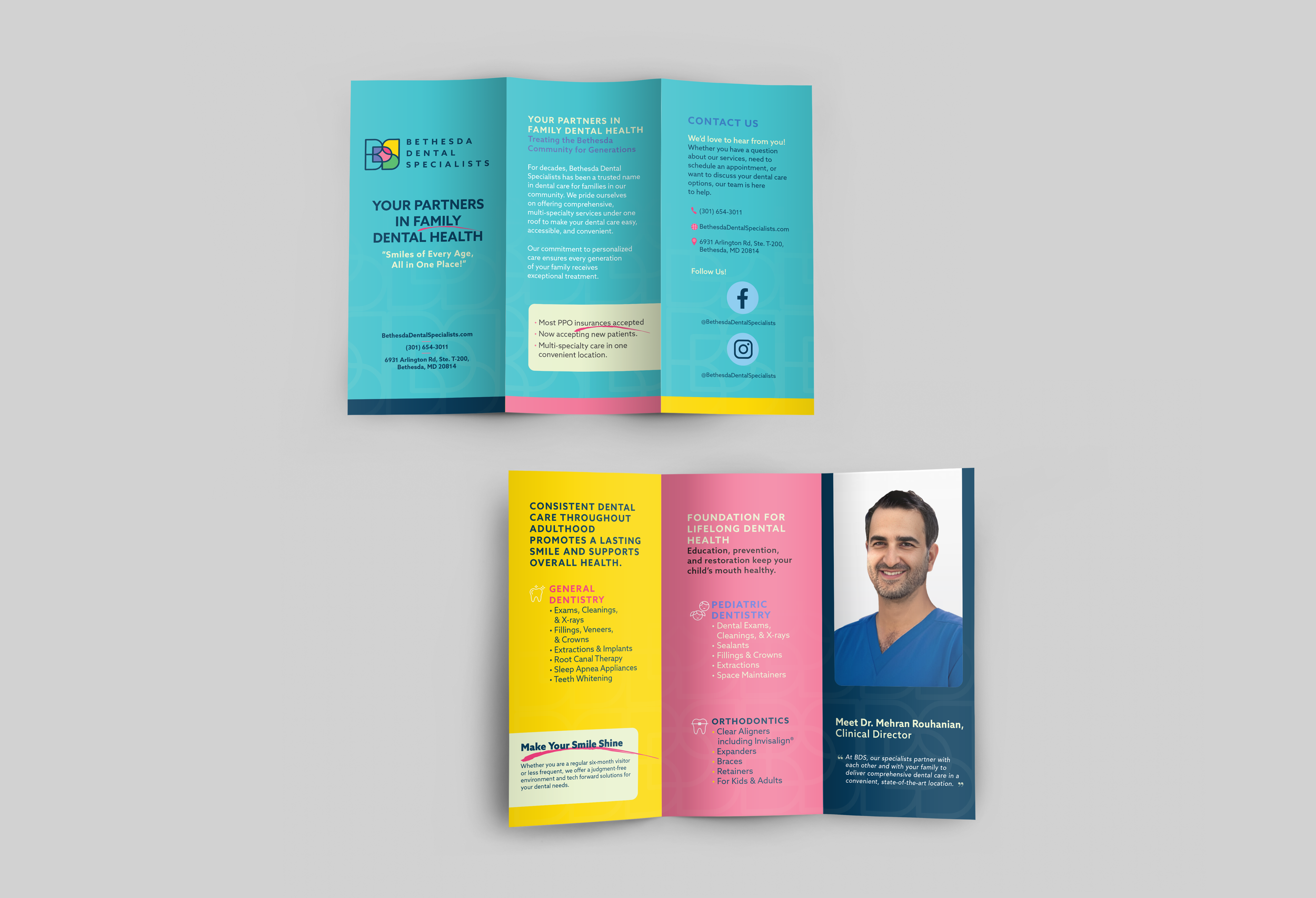
The brochure expands on the brand's color blocking — using yellow, pink, and teal panels to organize services and guide the reader through the practice's offerings.
Creative materials displayed in this portfolio were created by Ariana Mexquititla in a professional capacity for clients and remain the intellectual property of their respective owners. Display of these materials is for portfolio and demonstration purposes only and does not imply ownership, endorsement, partnership, or transfer of intellectual property rights. All trademarks, service marks, trade names, logos, and copyrighted materials are the property of their respective owners. Select Dental Management and affiliated/supported practices retain all rights to their respective brands and materials